When I first started writing, my former publisher encouraged me to work on a series. So, I started writing what would become The Darcy and Elizabeth Series that consisted of the following:
The Women of Longbourn
Attending a Ball
Darcy and Bingley
Darcy Chooses Part 1
Darcy Chooses Part 2
Elizabeth’s Choice
The first three are short prequels which were introductions or lead-ins to Darcy Chooses Parts 1 and 2. Each of these needed a cover. Unfortunately, from the beginning, we had nothing but trouble farming out the covers. First artist was lousy, and the second was very talented but uncooperative.
So, I began designing my own covers and putting them together in Photoshop Elements which is an abbreviated and less expensive form of Photoshop, and that gave me excellent results although I was a novice at it. At least the covers didn’t have the problems that caused us at one point to use one cover for all the series. I know, I know. What a dumb bunny I was to allow it. Never more.

A friend and I were playing with photoshop and elements one day, and she basically came up with a cover that I went with two years ago when I put Darcy and Bingley and Darcy Chooses Parts 1 and 2 together in one volume to make Darcy Chooses – The Complete Novel.

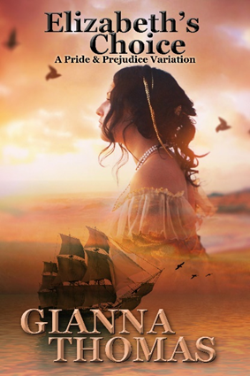
I was delighted when I found the cover for Elizabeth’s Choice was romantic, and it had a ship that went along with their trip to Ireland as well as having a lady to represent Elizabeth. So, the series was redone to complement Elizabeth’s Choice. That cover was easy as I bought it, and we added the titles and author name. But what about the other four?
Why did I choose this cover? Because it makes a great thumbnail. It stands out and is noticed. When Darcy Chooses – The Complete novel first published, it was #820 in the Kindle Store. Even with this blatantly non-Regency cover, this book was in the top 100 of two genres for months, two years later. I was almost afraid to change it. 😊 But my daughter and I wound up redoing all the covers in spite of the fact that I loved what I came up with to go with Darcy Chooses brilliant orange cover. We thought we might use them for something else as the series needed Regency covers at that time.
Elizabeth’s Choice had the theme of Darcy and Elizabeth’s honeymoon to Ireland. Easy peasy. However, The Women of Longbourn, although having a connection to the series, had a theme related to Elizabeth’s journal and her entries a se’nnight before the Meryton Assembly. How would we show the relationship to the series in the cover? The Darcy Versus Series was a lot easier in that regard as I’ll show you in a minute. In the meantime, we realized that building a cover with similar colors and having the same fonts with the title and author name in the same positions might give us what we needed. And, thus, The Women of Longbourn cover came about, and we were pleased.

The Darcy Vs Series didn’t present the same problems that The Darcy and Elizabeth Series did. It was simpler and carried the thought of Pemberley, Darcy’s home and Elizabeth’s future home.
First of all, there was no series when I wrote Darcy Vs Bingley that started out as a one-shot on FanFiction.net with only one chapter. I mentioned to the readers that I intended it to only be a one-shot and asked if they wanted more. They did, so I did more. In fact, this book shoved Elizabeth’s Choice out of the way and demanded to be written FIRST. As a consequence, it was published in the spring of 2017, and Elizabeth’s Choice was published in February 2018. And later I worked on Darcy Vs Elizabeth and published it in March 2020.
DVB centered around Caroline Bingley’s rabid pursuit of Darcy, so she could become mistress of Pemberly. Darcy Vs Lady Catherine showed the lack of ethics and morality that Darcy’s aunt was willing to employ to guarantee her daughter Anne became mistress of Pemberley. Since Chatsworth has always been my idea of Pemberley, I used a painting by Marlow done in the late 1700’s. Cropping portions of the painting and flipping the scene gave me what I wanted in a series look. Because of the more serious theme of DVLC, I had my daughter incorporate the tree as a type of threat to Pemberley which is what Lady Catherine turned out to be. My daughter has also turned out to be a gem in getting different looks of the fonts that I’m really pleased with. It pays to have a techie in the family. 😊 And this is what the four Darcy Versus book covers look like together.


Doing my own covers has been a challenge but has been great fun as well. And I love working with my daughter. Although both of us have strong personalities, we really work well together…to my surprise. 😊 And both of us are enjoying this adventure in writing and design.
If you are not as happy with book covers that you are buying or having done, you might consider doing your own. It is very rewarding, and you can also get exactly what you want.
https://www.facebook.com/GiannaThomasAuthor
Amazon Author Central https://www.amazon.com/author/giannathomas
Leave a Reply to WendyCancel reply